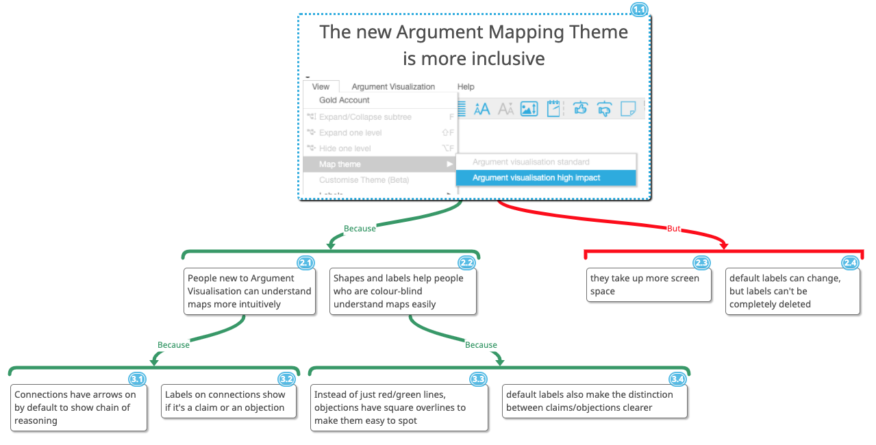
From today, you can use the new High Impact argument mapping theme to make your argument visualizations easier to understand and more inclusive.
The new visual theme makes the distinction between claims and objections clearer by providing default connection labels (“Because” and “But”), and also using square angle overlines for objections. This is particularly important for readers who are colour blind, since the standard theme only uses red/green colour to distinguish between the two types of concepts.
By providing labels, and also default arrows pointing from a claim to supporting reasons and objections, the new theme makes it easy to intiutively understand the visualisations, even for people who are not experienced in argument mapping.

To set the visual theme, just use View -> Map theme from the application menu, and select the high impact option. To switch back to the old theme, use the menu again and choose the standard option.